Building Multilingual WPF applications - Part 3
Since Part 2 on building Multilingual WPF applications, one unresolved issue has grabbed my attention as the proverbial stone in one's shoe - that of not getting the custom markup extension working correctly.
As a refresher, I had implemented a strategy to change the interface language at run-time without needing to compile satellite assemblies (and have multiple versions of the same application, one for each language). I also noticed how the bindings from the UI to (what is now) the ViewModel were quite long and ugly when reproducing the same lines of XAML for each element that needed localised text, and sought to replace these expressions with something simpler.
So at the end of Part 2, I had managed to simplify ridiculously long binding expressions such as this:
<TextBlock Text="{Binding Path=currentLanguage,
		Converter={StaticResource uiText}, ConverterParameter=ApplyAllLabel,
		Source={x:Static vm:CommonViewModel.current}}" />
to this, via attached properties:
<TextBlock vm:Extensions.TextKey="ApplyAllLabel" />
However, there was a major flaw - it created a dependency on there being a Text property on the control, which basically had to be a TextBlock. For custom label controls, this logic (and the attached dependency properties) had to be replicated. An ugly hack that shouldn't need to be done.
So I had another crack at implementing this via a custom markup extension, remembering that a Binding is a MarkupExtension, like the custom extension I was creating. That means that the ProvideValue method simply has to invoke the ProvideValue method on the underlying Binding, and return the result. Therefore, my custom markup extension needed the following:
- A private Binding instance, which is initialised in the constructor,
- A public property, which gets and sets the CommandParameter of the Binding (i.e. the text key)
- The ProvideValue implementation, as mentioned above:
public override object ProvideValue(IServiceProvider serviceProvider)
{
	return _lookupBinding.ProvideValue(serviceProvider);
}
To use it in the UI, the markup extension is used in the following way:
<TextBlock Text="{ext:LocalisedText Key=ApplyAllLabel}" />
Even better, the same markup extension can be used for custom controls, such as my labelled form controls:
<uiCt:TextLabel labelText="{ext:LocalisedText Key=DescriptionLabel}" />
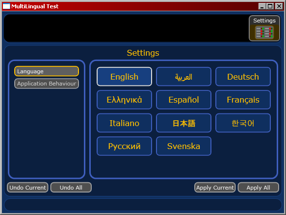
The good news is the output is the same:

Localising Right-to-Left Languages
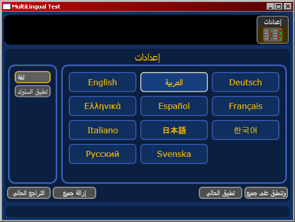
One other thing that was left unresolved from Part 1 was the notion of localising right-to-left languages. The problem is best described by the following screenshot:

For readers of right-to-left languages such as Hebrew and Arabic, the UI would be somewhat confusing when its layout doesn't flow logically in a manner consistent with reading order.
So I embarked on an adventure to perform this extra localisation, armed with the buzz from getting the custom markup extension working. This saw me creating converters for Thicknesses (for Margin and Padding), CornerRadiuses (for Borders), Dock property enumerations, and HorizontalAlignment. Piece by piece, I was getting the interface flipped in the right order. I was just creating the conversions for the Grid's ColumnDefinitions property and Column attached property, when I discovered something that made all this unnecessary.
The FrameworkElement.FlowDirection (attached) property.
The beauty of this is that I only need one binding - at the root level control inside the main window - since this value is inherited by every FrameworkElement below it in the visual hierarchy. This binding only needs to look at the 'isRightToLeft' property of the UILanguageDefinition instance and convert that (via a ValueConverter) to a FlowDirection enumeration, and a custom markup extension is created to simplify the 'binding' expression in XAML.
Naturally, this attached property is quite powerful. Here are some points / gotchas to consider:
- Custom panels are automatically laid out in reverse, so you do not need to create an 'isReversed' property (or similar) and adjust your ArrangeOverride calculations accordingly.
- Bitmap images and shapes (e.g. Paths) are reversed. If you want to preserve the rendering of these, independent of flow direction (e.g. for corporate logos / branding), then you need to override the FlowDirection by setting it to LeftToRight.
- If the interface has a FlowDirection of RightToLeft and an element (e.g. Image) has a FlowDirection of LeftToRight, then the Margin on the element will act in a RightToLeft manner. Since a Padding acts on the internal visual hierarchy of the element, a padding will behave in a LeftToRight manner.
- TextBoxes containing language-invariant data should have the FlowDirection set to LeftToRight. Ideally, this should be set in a Style to minimise repetition and guarantee consistency.
So in practice, the main window's immediate child element, a DockPanel, is declared as:
<DockPanel FlowDirection="{ext:LocalisedFlowDirection}">
where the LocalisedFlowDirectionExtension is defined as follows:
public class LocalisedFlowDirectionExtension : MarkupExtension
{
	private Binding _flowDirectionBinding;

	public LocalisedFlowDirectionExtension()
	{
		_flowDirectionBinding = FlowDirectionConverter.createBinding();
	}

	public override object ProvideValue(IServiceProvider serviceProvider)
	{
		return _flowDirectionBinding.ProvideValue(serviceProvider);
	}
}
The static createBinding method creates a binding that uses a shared converter with this logic at the core of its Convert method:
bool isRightToLeft = (bool)value;
return (isRightToLeft)? FlowDirection.RightToLeft : FlowDirection.LeftToRight;
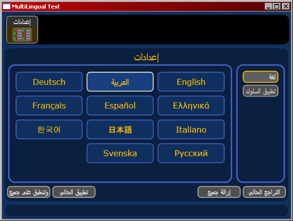
With that done, the UI is rendered as expected:

