Backstage Behind the Scenes
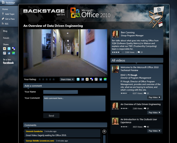
Today marks the launch of Office 2010's technical preview, accompanied by a new site showcasing the work that Microsoft has been putting in to deliver Office 2010 - http://www.office2010themovie.com/. As one of the developers working on the site, I am able to provide a brief behind-the-scenes of the Behind-the-Scenes, so to speak.
Since I mostly worked on the Silverlight-based front-end, this will mainly focus on the Silverlight aspect of the site - although a pure HTML version exists for visitors using mobile phones.

As you can probably guess, the entire page (i.e. not just the video player) is pure Silverlight 2.0. This has a number of benefits over using a mixture of HTML and Silverlight objects:
- Navigation between various 'pages' (I prefer to refer to these as 'Views') does not affect the inter-page navigation as is stored in the browser's history. This makes it very useful for online applications where entities are added, viewed, edited and removed without the 'back' button history growing ever larger. No need to do asynchronous JavaScript either.
- The layout possibilities are more flexible without resorting to table-based layouts in HTML. Even if layout is div-based and using CSS, there are a number of common technical limitations that make some aspects of design impractical for web pages, for example equal column heights with variable content in each column.
- Every control can be styled in a much more flexible manner by overriding control templates. That's how we were able to add shadow effects and gradients to the text boxes, for example.
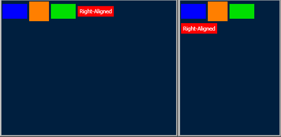
While Silverlight 2 has its limitations in comparison with WPF (as previously mentioned), it still allows the creation of custom panels so that the desired layout mechanism can be achieved. In the absence of a suitable WrapPanel for preserving right-justification of the 'Play Video' button in the video catalogue list, I was able to create one from scratch. (See the below WPF screenshot for why the standard WrapPanel is inadequate.)

There are some cases where particular layouts may be possible in HTML+CSS with floating divs, etc., however there are many cases where ugly hacks and/or verbosity would be needed to come close to the intended design. (Stay tuned for another custom panel coming to the home view on July 20...)
The project itself took our team (4 developers, 1 designer, a project manager, deployment engineer and client liaison representative/tester) a little over two weeks sprinting from start to finish, with the application being functionally-complete (or as close as possible to it) at the end of the first week. That left this past week for styling the interface from generic black rectangles to the polished interface you see on the live site - including stabilisation and design convergence (making the actual interface match the design mockups down to the nearest pixel, where possible).
Naturally, there were challenges along the way. Challenges such as getting the player working correctly with streaming video, supporting mouse-wheel scrolling on as many browsers as possible, implementing the Model-View-ViewModel (MVVM) pattern without native Silverlight commands (Thanks, Chris, for introducing me to your implementation). Yes, there was the figurative blood, sweat and tears as we battled seemingly endless design tweaks, compile times and bugs. But it was worth it, and I, for one, enjoyed it.
Now, time to celebrate...
