
Wellywood Controversy
For those who haven't been in touch with local Wellington news, part of the 'talk of the town' is the controversial 'Wellywood' sign, inspired by the well-known 'Hollywood' sign in L.A. (just switch 'Ho' with 'We' and bob's-your-uncle). Wellington International Airport Limited (WIAL) owns the land on the Miramar cutting, and decided it would be nice to put such a sign there.
Several months later, they have resource consent and have twice announced they were putting up 'that' sign - both times to severe backlash from the general public. Fortunately the powers-that-be have taken this opposition on board and created a competition to come up with an alternative design, that more of us could be proud of.
Naturally, I decided to take them up on the opportunity ;-)
Firstly, the issues with the original proposal that I wanted to address were:
- A sense of 'tackiness' - taking a colloquial term coined through the media, to describe the local film industry catalysed through the work of Peter Jackson, Weta Workshop & Weta Digital, and giving that some sort of official status. While I have great respect for what these people have achieved, there is more to Wellington than the film industry to be proud of.
- Lack of originality - the font is exactly the same as the well-known Hollywood sign. 7/9 of the sign reads exactly the same.
- A sense of 'me-too' desperation - Hollywood is an actual name of a suburb, they found their identity. Wellington has its own identity that we should nurture and develop, and it won't come from aping others and shouting for attention. That seems too 'try-hard', and gives me an impression that Wellington isn't confident in or proud of itself to stand on its own feet.
There were several main criteria for the submitted concepts, including: fit within a 27 x 3.5m area; not have protrusions more than 0.5m; no lighting or illumination; and realistically be constructed within an $80,000 budget. Concepts don't necessarily have to be a sign, but could also be an image or artwork.
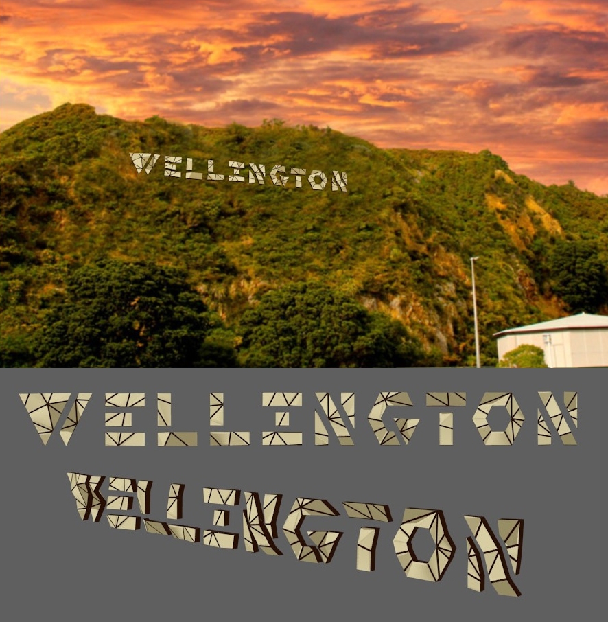
With that in mind, here's what I came up with:
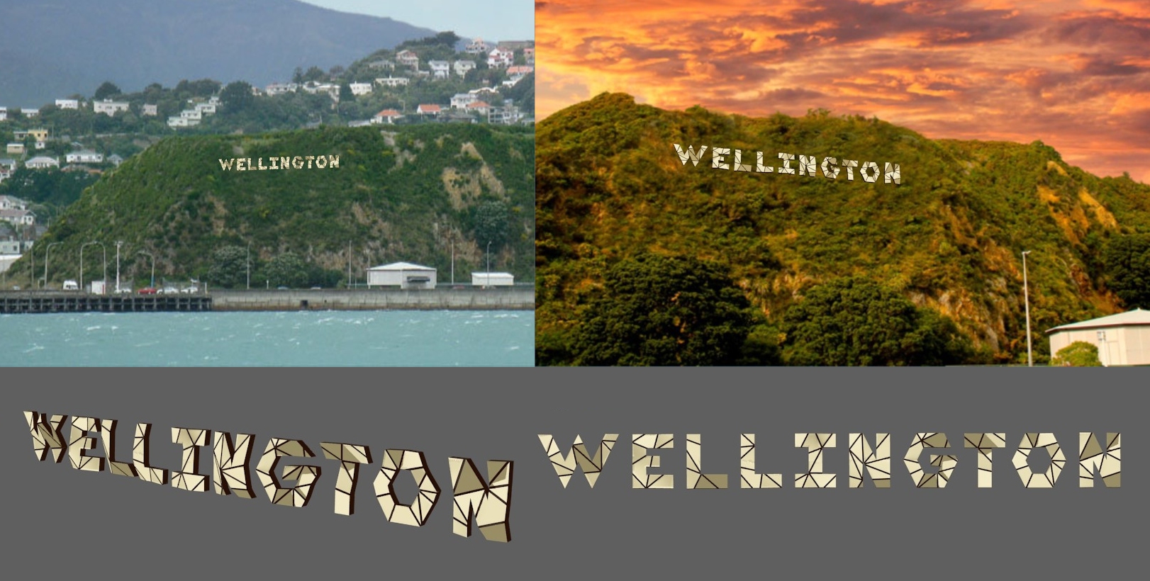
No 'Wellywood' - Wellington does just fine. Original, angular font, which complements the 'rock-face' texture. This texture also complements and draws inspiration from the interior of the 'rocks' international airport terminal, which has recently won the Transport category at the Inside Festival.
For those who don't see the link with the film industry, bear in mind that I created this using a 3D modeller called Blender - which is similar to software that modellers use at Weta Digital. The black lines evoke a sense of a triangulated 3D mesh. I don't believe we need imagery of Gollum, King Kong, etc. to highlight this; also considering that such imagery would likely be under strict copyright from the respective studios.
Here's another variation, with a slightly more futuristic font:
In the end, over 350 submissions were received. Five were put forward as the finalists for public vote. Yes, I can live with the fact that neither of mine were selected, but those finalists had better be good. Sadly, I was a little underwhelmed, and I wasn't alone. Someone commented, "Are our designers that inept?" Another commented, "I can't believe these are the five best from more than 300 entries! Let's see all the options listed."
Well I hope I've proved the first commenter wrong, and whetted the appetite of the second.